Text Rich text with well-defined typographic styles. This is a hero text.h1: This is a h1 text.h2: This is a h2 text.h3: This is a h3 text.h4: This is a h4 text.p: This is a p text.sm: This is a sm text.b: This is a bolded text.em: This is a emphasized text.Card component has three parts: header, body, and footer, which can be separately defined by slot tags. Card header
Lorem ipsum dolor sit amet, consectetur adipisicing elit. Perspiciatis fugit earum voluptas officia, quasi saepe et commodi, dolores cumque quam fuga ullam, itaque ea dignissimos asperiores adipisci ad eveniet repellendus
Cards' visual styles can be defined by
variant attribute. There are three variants: shadow(default), flat, and borderedThis is a
shadow cardThis is a
flat cardThis is a
bordered cardIf
isHoverable attribute is enabled, the card will have shadow effect while mouse is hovering over it. Hover effect enabled
Additionally, you can also design a fine looking card with image cover.
TO EXPORE
The breathtaking scene in nature
DIVE INTO
Life is best spent by the sea


Hi there!Dignissimos asperiores Lorem ipsum dolor sit amet, consectetur adipisicing elit. Perspiciatis fugit earum voluptas officia, quasi saepe et commodi, dolores cumque quam fuga ullam, itaque ea dignissimos asperiores adipisci ad eveniet repellendus

Hi there!Dignissimos asperiores Lorem ipsum dolor sit amet, consectetur adipisicing elit. Perspiciatis fugit earum voluptas officia, quasi saepe et commodi, dolores cumque quam fuga ullam, itaque ea dignissimos asperiores adipisci ad eveniet repellendus
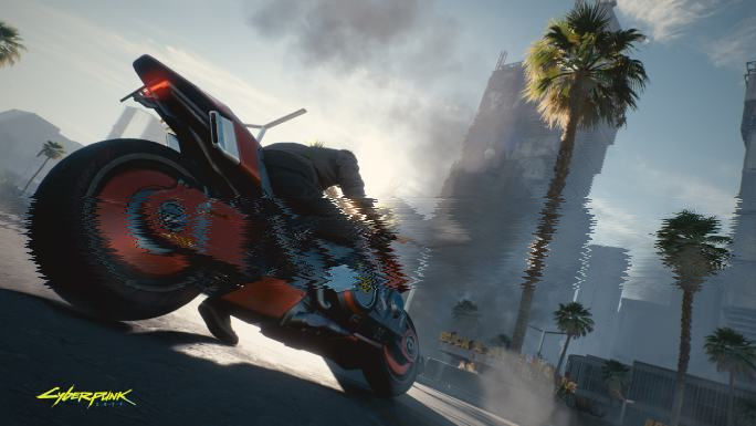
Cyberpunk 2077 is now released
2077/10/13Cyberpunk 2077 is an open-world, action-adventure story set in Night City, a megalopolis obsessed with power, glamour and body modification
Game
RPG
Cyberpunk
CDPR
Designed & Coded by Tianyu @2022